Sydney Fish Market. Rebrand

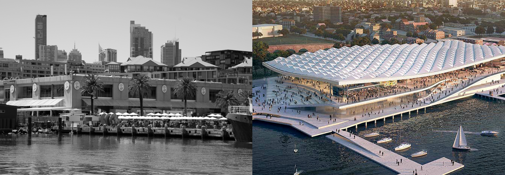
Since 1871, the Sydney Fish Market has been impacting the
fishing industry and state economy, becoming the biggest fish market in
the southern hemisphere. It evidently has grown more and more into an attraction for local and overseas visitors.
As of 2023, the new building will be a whole new market, with estimated visitor
growth to double by 2026. It was an opportunity to get involved and create a refreshed visual identity that speaks to a broader audience,
including overseas and domestic tourists while preserving the heritage and authenticity of the market.
A new brand identity to converge the land and the ocean
The new Sydney Fish Market identity embodies the brand’s vision: to converge the people and the sea, the land and the ocean. Indeed, the new Sydney Fish Market logomark represents the ocean, and the logotype symbolises the land, uniting the two in a standalone logo. The colours reflect each of the sides accordingly.

Typography
The typographic style allows the brand to express it’s long lasting stable posture and at the same time communicate and be attractive to wider audience.

Modular visual language
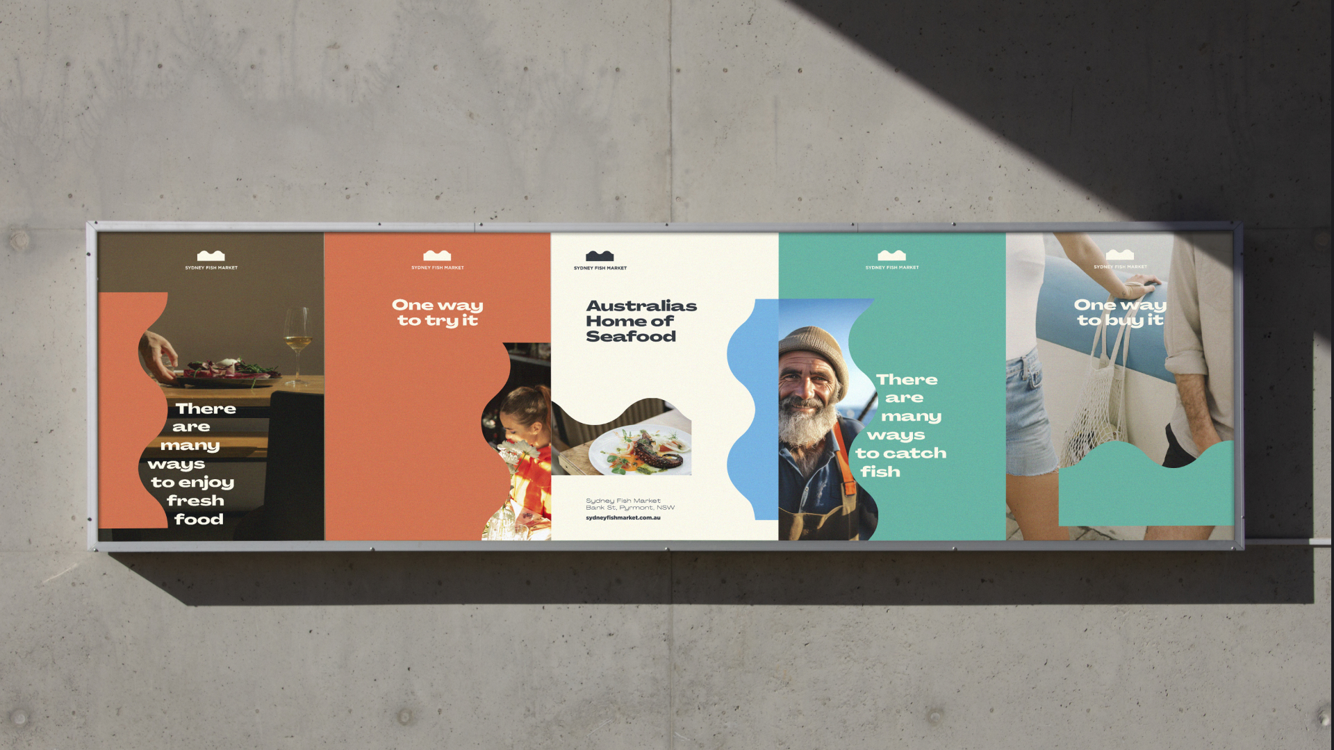
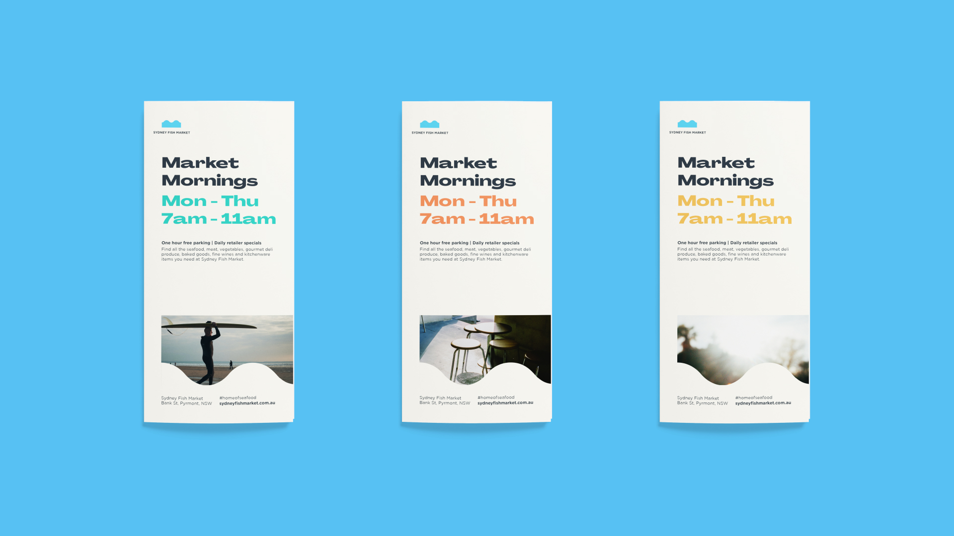
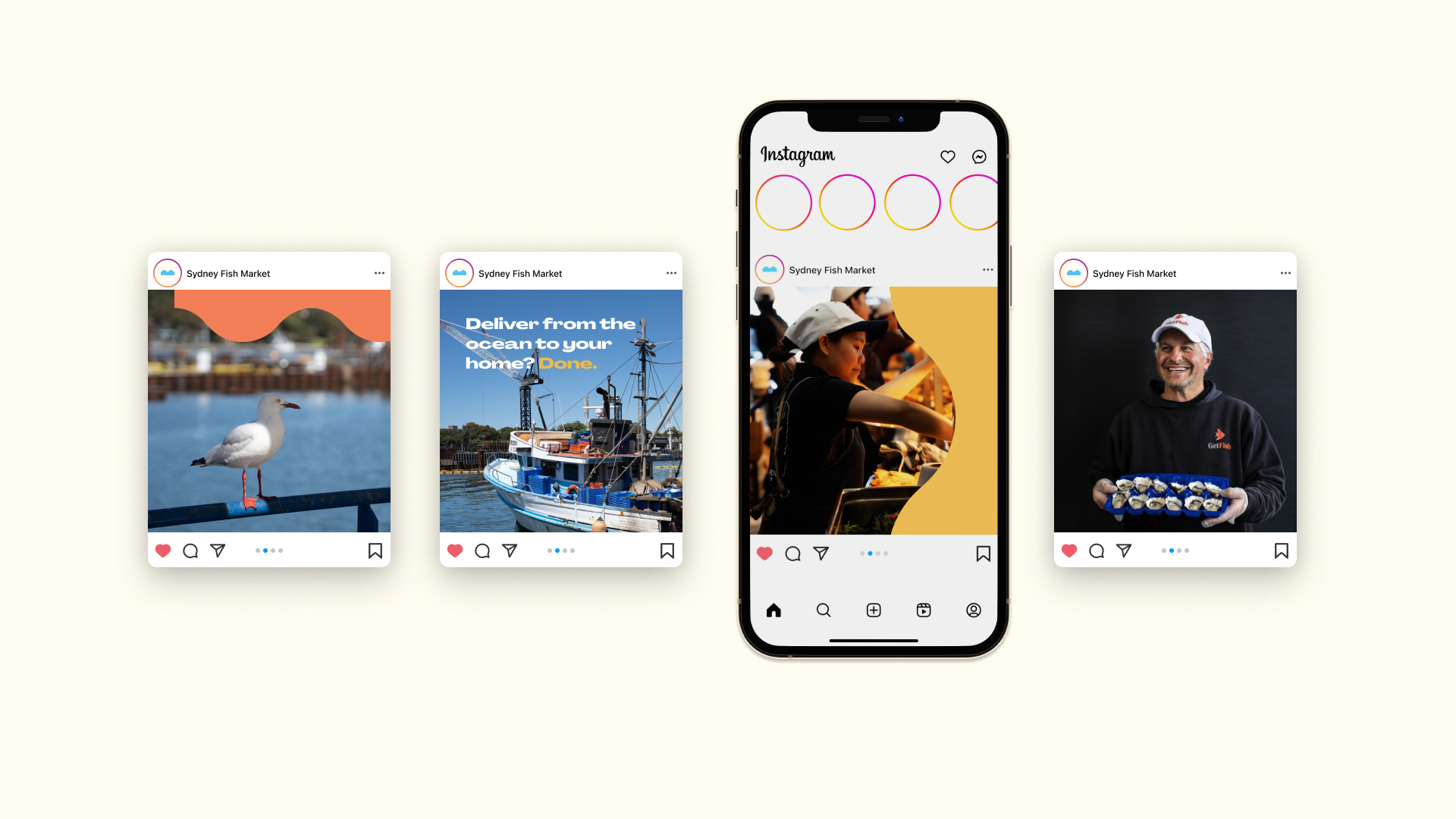
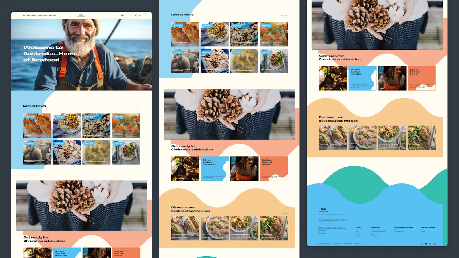
The logomark can infinitely repeat itself horizontally and vertically. This opens up possibilities to compose different shapes or combinations of shapes that create visual interplays with images and colours. Such visual language can communicate certain moods and situations and be a strong point of brand recognition.




About
visual brand identity
educational project
Australia, 2023